Last Thursday, when I wrote my blog post, I was so irritated about Ubuntu's bad font rendering I didn't know what to do. The TrueType bytecode interpreter patents have expired since long ago and I'm using mostly the same fonts on Linux and Windows so there was no way to explain Windows superior font rendering other than that it actually does a better job.
That, I cannot stand. Linux should work at least as well as Windows on everything, especially when it comes to something as crucial as font rendering.
I set out on a deep diving quest into Linux font rendering infrastructure trying to find out exactly what was wrong with it. Turns out I wasn't the only one dissatisfied with the way fonts looked. I prefer Window 7's font rendering which, to my eyes, appear much crisper and slender than how fonts look in Linux.
Take a look at the screenshots with the Georgia font below, first how it is rendered in Windows 7:

And how it looks in Ubuntu:
The difference is considerable. To my eyes, Ubuntu's version is much to thick. While both systems use almost the same technology to render the glyps, the reason for the big difference in appearance becomes clear when you zoom up:

Ubuntu's rendering is on the left and Windows on the
right. Both use subpixel anti-aliasing, but Windows
variant is much lighter. And since I prefer the Windows
rendering, I set out to find what configuration knob you
can tweak in Ubuntu to get the same appearance. Turns out
there is none. Using KDE's font configuration GUI, you can
change the true type hinting from medium or full to slight
which gives ligher glyphs but distorts their shape to
much. Especially Verdana and Arial seem to be dependent on
lots of hinting to render properly. You can also edit your
~/.fonts.conf file and change the LCD
filtering style FreeType
uses. Unfortunately, it seems like that setting doesn't
work correctly, because setting it to something other than
lcdnone or lcddefault has no
effect. lcdnone disables LCD filtering
entirely so you get severe color fringes around the text.
Then I tried hacking the FreeType sources which was easier done than expected because the only thing I had to change was few lines like it is described on this wiki page. It didn't provide the results I desired though it just made the text more gray than black, not crispier like in Windows.
Then I luckily found a site called infinality.net on which someone had already published patches to FreeType and Fontconfig to improve font rendering. After twiddling with them a bit and adding a PPA repository I got some really impressive results:

This is with USE_STYLE =
"WINDOWS7LIGHT". Infinality has many other font
rendering modes, but this is the one I like the most. It
is not exactly how it looks on Windows 7, but very
close. I suspect the remaining differences is caused by
subpixel glyph positioning which Windows 7 uses but Xorg
doesn't support. The difference is even greater when it
comes to smaller sans serif fonts, which are used for
desktop GUI elements. Often they are rendered as black on
gray background.
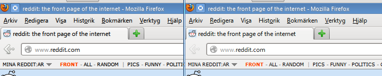
Ubuntu's default on the left and Infinality's Windows 7 Light rendering on the right. I think the improvement in readability is huge here. There is no blur nor extraneous thickness in the menu or address field. The glyphs are well balanced so that no character looks heavier than the other.
So use the Infinality patches! They are great and you will be very pleased with the result.
Inga kommentarer:
Skicka en kommentar